The Elections Performance Index, or EPI, tracks 17 distinct indicators of election administration effectiveness. A state's overall average is calculated from its performance on all indicators, relative to all states across comparable federal election cycles—either presidential or midterm. A state with an average of 100 percent in a presidential year, such as 2012, would have the best value of any state on every indicator across all presidential years (in this case, 2008 and 2012), and a state with an overall average of zero in any given presidential year would have the worst value of any state on every indicator across all presidential years. This also holds true for midterm years, which currently include 2010 and 2014. Because these averages are based on the performance of all states, even if a state had a 100 percent average there still is room for improvement in future elections.
Further, because the overall EPI average is an average of all indicators, improvement on any one indicator, relative to other states, will not change the number much. A state that performs well on one indicator but close to average in every other will not, overall, perform at a level that is significantly different from the national average. Consequently, for a state's overall average to increase from one year to another, that state must do better across many indicators, relative to other states.
Presidential and midterm elections are not comparable using this interactive report because of significant differences in electorates, available data, and baseline scales. Additionally, of the 17 indicators of election performance, data are not collected for two—voting wait time and residual vote rate—during midterm elections, leaving 15 metrics and points of comparison for 2010 or 2014. For more information, please see the methodology.
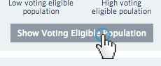 Click "Show Voting Eligible Population" to reveal outer circles scaled relative to the size of the voting eligible population fo reach state.
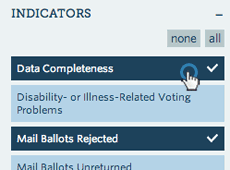
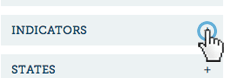 Expand the indicator section to turn off/on certain indicators for the score calculation.
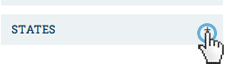 Expand the state section to hide states.
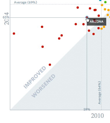 Hover over a state to see its EPI score for both years and voting eligible population if applicable.
 Click an indicator to recalculate the rank of each state.
 Click on a year to display state rankings for that year.
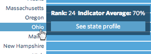 Hover over the state in the map, state name label or bar to see the rank and indicator average for that state. A click will take you to the state's profile page.
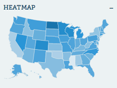 The colors in the map and bars represent the indicator average performance of the state for a particular year. The more intense the color, the better the performance.
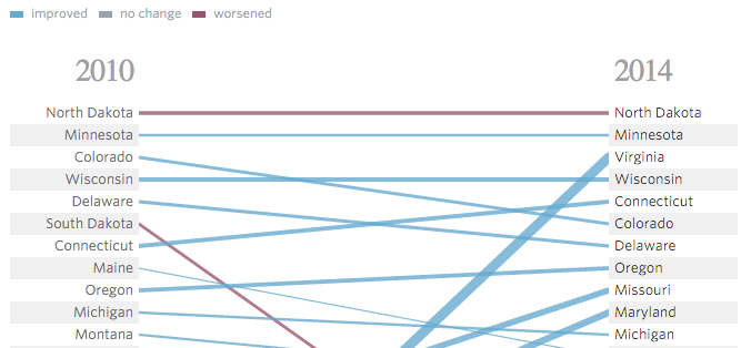 The "Compare Years" view compares state rankings based on EPI score for election years 2010 and 2014 and 2008 and 2012. The thickness of the lines represents the amount of change in the indicator average. A blue line represents an improvement in the indicator average, while a red line indicates that the state has worsened. Hover over a state to see the corresponding rank location of that state in the other year.
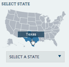 To start, select a state using the map or from the dropdown.
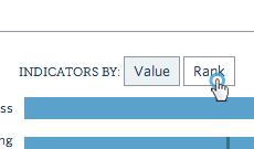 Click 'Value' or 'Rank' to switch between indicator values and the ranks of the state relative to all other states.
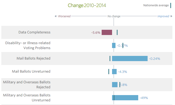 Click "Compare Elections" to display the change in indicator values comparing 2010 with 2014 or 2008 with 2012. Bars on the left-hand side of the "No change" line indicate that the state worsened, while bars on the right-hand side represent an improvement.
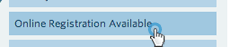 To start, select an indicator from the list.
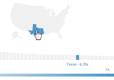 Hover over the map or the bars to reveal the state indicator value for that year.
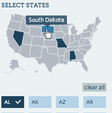 To start, select a state or predefined group. Click on addtional states and/or state average groups to see how they compare.
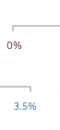 The minimum and maximum value for the selected year is shown at the start and end of the line.
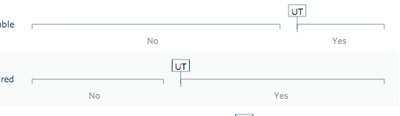 For indicators that have a Yes/No value (eg. Online Registration Available), two lines are displayed. The width of the line is proportionate to the number of states with that value.
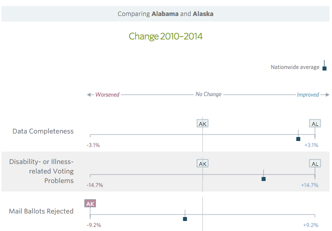 Click "Compare Elections" to display the change in indicator values comparing 2010 with 2014 or 2008 with 2012. The minimum and maximum change in value is displayed at the start and end of the line. When states and groups appear on the left-hand side of the "No change" line, that means the state or group worsened for that indicator, while the appearance of states or groups on the right-hand side indicates an improvement.